
What if the secret to a breathtaking family portrait isn't finding the perfect matching outfits, but rather embracing the beautiful art of imperfection? We've all felt that familiar prickle of anxiety when staring at a closet, wondering if a certain shade of navy will clash or how coordinated family photo looks will actually translate onto a large canvas in the living room. It's completely natural to feel overwhelmed by the pressure of these choices. You want your family to look like the best versions of themselves, not like a stiff department store catalog from twenty years ago.
The good news is that planning your wardrobe can be a calm, creative process rather than a chore. In this guide, you'll discover how to curate a sophisticated, timeless wardrobe that feels organic and moves beautifully in the natural light of the Research Triangle. We'll explore how to layer textures and muted tones to create a visual harmony that complements your home decor perfectly. You're about to learn a stress-free approach to styling that ensures everyone feels like themselves, resulting in photos that are ready to become museum-quality heirlooms for your walls.
Key Takeaways
- Move away from identical outfits and embrace a cohesive color story that feels natural and timeless rather than dated.
- Master a simple three-step framework for building coordinated family photo looks by selecting a single anchor piece to guide your entire palette.
- Learn to select fabrics and tones that thrive in the specific seasons of the Research Triangle, ensuring comfort and style during your on-location session.
- Discover how mixing textures and varying pattern scales adds a sophisticated depth that translates beautifully to large-scale archival prints.
- Understand the vital connection between your wardrobe choices and the final aesthetic of museum-quality canvases that will grace your home for years.
Beyond Matching: The Art of Coordinated Family Photo Looks
True coordination is a visual conversation between textures, tones, and light; it isn't a uniform. For years, the default for a family session was a sea of identical white t-shirts and denim jeans. While this felt safe, it often created a flat, dated aesthetic that lacked depth. When we look back at the history of photography, we see a shift from stiff, formal posing toward capturing the genuine spirit of the subjects. Modern coordinated family photo looks embrace this evolution by focusing on a cohesive color story rather than a strict set of matching clothes. This approach feels more sophisticated and allows the unique rhythm of your family to take center stage.
Choosing a curated wardrobe doesn't mean your session will feel rigid or over-planned. In fact, a thoughtfully selected palette often feels more relaxed because it mirrors how we actually dress in our daily lives. By stepping away from "matchy-matchy" outfits, you give each family member the freedom to wear something that fits their specific personality. This individuality is a cornerstone of authentic family portrait photography. When your daughter feels beautiful in her favorite lace dress and your son is comfortable in his soft linen shirt, their genuine smiles come much more easily.
The Psychology of Wardrobe Harmony
There is a profound connection between what we wear and how we carry ourselves in front of the lens. If you feel self-conscious in a stiff collar or a dress that doesn't quite fit your style, that tension will inevitably show in your expression. Building successful coordinated family photo looks is as much about emotional comfort as it is about aesthetics. When the colors and fabrics feel like an extension of your family’s natural energy, the anxiety of "performing" for the camera melts away. This ease is the secret ingredient for those unposed, heartfelt moments that look so stunning in a finished gallery. We want you to feel elevated, but still entirely like yourself.
Why Coordination Matters for Wall Art
We often encourage families to think of their wardrobe as the first step in home interior design. Because these images are destined for museum-quality canvases and archival prints, the colors you choose should complement the spaces where they will hang. A neutral, earthy palette ensures your photos remain timeless as your home decor evolves over the decades. By viewing your family as a single visual unit, we can ensure the final piece feels balanced. This intentionality transforms a simple photograph into a piece of fine art that feels at home on your walls, rather than just a snapshot of a moment in time.
The 3-Step Framework for a Cohesive Palette
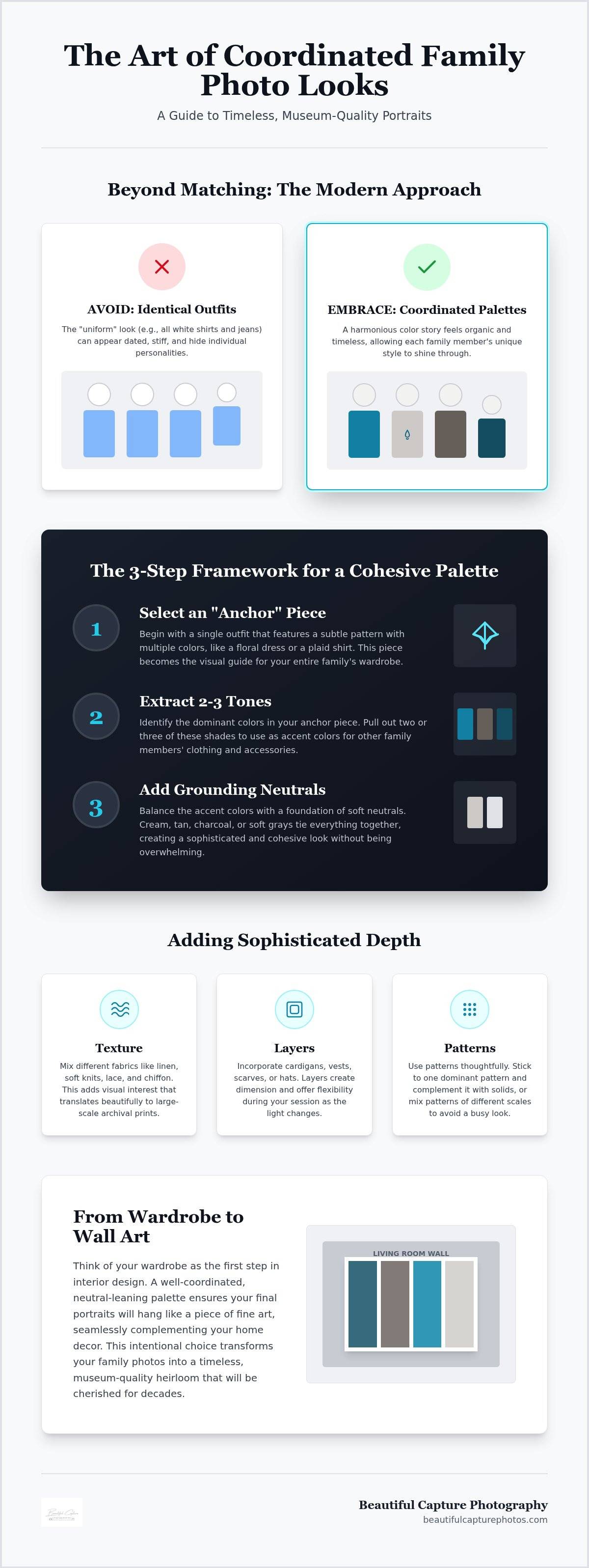
Organizing a large group doesn't have to be a puzzle. By following a simple structure, you can move from a closet full of options to a curated collection of coordinated family photo looks that feel effortless. This process is about finding a balance between variety and unity. How do you know if you've chosen the right starting point? Look for a piece that makes you feel confident and carries at least three distinct shades. This framework helps you build a look that feels intentional but never forced.
- Step 1: Select an "Anchor" outfit. This is usually Mom's dress or a little one's outfit. It should feature a subtle pattern with multiple colors to guide the rest of the choices.
- Step 2: Extract 2-3 tones. Look closely at that anchor piece and pick a few shades to repeat throughout the other family members' clothing.
- Step 3: Add neutrals. Use grounding colors like cream, tan, or charcoal to tie everything together and provide a place for the eye to rest.
Choosing Your Anchor Piece
Patterns like soft florals or muted plaids are excellent starting points. They offer a range of colors without being distracting. Look for fabrics that provide movement, such as chiffon or soft linen, which catch the natural light beautifully during an on-location session. An anchor piece serves as the visual North Star for your entire session palette. Instead of feeling like you must shop for an entirely new wardrobe, look for a piece you already love that carries a sense of organic beauty and timelessness.
Distributing Colors Effectively
Once you have your colors, think about where they land. Avoid dressing two people standing next to each other in the exact same shade. Instead, use accessories like scarves, hair bows, or vests to pull accent colors through the group. This creates a rhythmic flow that guides the eye across the portrait without any one person pulling too much focus. It's about creating balance so the viewer sees the family as a whole rather than a collection of separate outfits. This distribution ensures everyone looks like themselves, just slightly more elevated.
Before the big day, lay every outfit out on the floor together. Step back and look at the group. Does one piece feel too bright? Is there enough neutral space to let your faces shine? This simple check ensures your final image feels balanced and ready for your home's walls. If you're looking for more personalized guidance, our portrait sessions include a collaborative styling process to ensure your vision comes to life perfectly.
Seasonal Styling for the Research Triangle Landscape
The landscape of the Research Triangle is a living canvas that shifts dramatically throughout the year, offering a diverse array of backdrops for your family session. Designing coordinated family photo looks requires a keen eye for how these seasonal shifts interact with your wardrobe. Whether we are wandering through a sun-dappled park in Raleigh or exploring the historic textures of Durham, the environment should feel like a natural extension of your family’s story. By aligning your color palette with the local foliage and light quality, you ensure your portraits feel grounded in the specific beauty of North Carolina.
Spring and Summer: Light and Airy
Spring in Raleigh brings a delicate explosion of soft greens and blooming gardens that practically beg for a palette of muted pastels. Think of dusty blues, soft sage, and pale blushes that mirror the fresh energy of the season. As we move into the warmth of a Cary or Morrisville summer, the humidity becomes a practical factor to consider. Breathable, light fabrics like linen and organic cotton are essential for keeping everyone comfortable and relaxed. These materials catch the "Golden Hour" glow beautifully, creating a soft, ethereal quality in the final images. We often recommend locations like Fred G. Bond Metro Park, where the water and trees provide a serene, bright backdrop that complements a lighter wardrobe perfectly.
Fall and Winter: Rich and Textured
When autumn arrives in Durham, the landscape transforms into a masterpiece of deep ochres, rust, and forest greens. This is the time to embrace richer tones that hold their own against the vibrant changing leaves. However, it's important to choose jewel tones that are slightly muted to avoid clashing with the natural environment. As winter settles over Chapel Hill, the scenery becomes more dormant and minimalist. This is the perfect opportunity to introduce depth through heavy knits, wool layers, and rich textures. These elements add a tactile quality to your photos that translates exquisitely to archival prints, giving the images a sense of warmth even in a cooler setting.
Practicality is just as important as aesthetics when we are working on-location in our local parks. North Carolina trails can be uneven, so we always suggest prioritizing stylish yet practical footwear like leather boots or polished flats. This allows your family to move naturally and focus on each other rather than worrying about a stray root or damp grass. When you choose fabrics and colors that respect the season, you create a harmonious image that feels timeless and true to the moment.
Adding Depth: Texture, Layers, and Patterns
While color provides the essential foundation, texture and layers are the elements that truly breathe life into your images. Many families worry that adding patterns will lead to visual chaos, but when used thoughtfully, these details create a sense of movement and sophistication. Designing coordinated family photo looks is about more than just matching hues; it’s about creating a tactile environment that feels as good as it looks. By mixing different fabrics and subtle prints, you move away from a flat, two-dimensional appearance toward a portrait that feels rich, lived-in, and authentic.
One of the most effective ways to build this depth is through the rule of scale. If Mom is wearing a dress with a larger, organic floral pattern, a child might wear a shirt with a very fine, small-scale texture or a solid knit. This contrast allows the eye to travel easily through the group without getting stuck on one busy area. We also encourage you to think beyond color when considering black and white prints. In a monochrome image, the color of a sweater disappears, but the chunky weave of the wool or the delicate edge of a lace sleeve remains, providing the necessary contrast to make the portrait pop.
Mastering Patterns Without the Chaos
To keep your gallery feeling cohesive, we generally suggest a "one pattern for every three people" guideline. This ensures that patterns don't compete for attention or overwhelm the frame. Choose "quiet" patterns, such as those with low-contrast colors or soft edges, that won't distract from your faces. When coordinating across different generations, look for patterns that share a common thread, like a similar floral motif or a shared neutral base. This creates a bridge between different styles while maintaining the individual dignity of each family member.
The Power of Texture
Texture acts as a silent storyteller in your wardrobe. Fabrics like velvet, wool, and heavy denim add a sense of luxury and weight to a portrait that simple cotton often cannot achieve. Natural light catches these materials in different ways, creating soft highlights and deep shadows that add immediate depth to the frame. Using texture allows you to create visual interest without relying on "loud" colors, which can sometimes cast unflattering tones onto the skin. Instead, a cream cable-knit sweater provides all the "pop" you need against a soft North Carolina forest backdrop.
Layers also play a vital role in candid family photography. A jacket that can be tossed over a shoulder or a scarf that catches the wind adds a sense of motion to the session. These pieces give you something to do with your hands and allow for natural, unposed interactions. Just remember to avoid logos, neon shades, and very thin stripes that can "vibrate" or create strange patterns on camera. if you’re ready to begin planning your own curated session, we would love to help you design your Portrait Sessions experience.
Visualizing the Result: Wardrobe and Archival Prints
Imagine walking into your living room and seeing a stunning, large-scale canvas that captures the very essence of your family’s love. While a quick social media post might forgive a clashing pattern or a distracting logo, high-end physical products demand a much more thoughtful approach to styling. When we create museum-quality canvases and archival prints, every detail of your wardrobe is magnified. The soft hues and intentional textures of your coordinated family photo looks aren't just for the camera; they are the building blocks of a piece of fine art that will grace your home for generations. This intentionality ensures that the focus remains on your family's connection rather than an outdated fashion choice.
From Digital Screen to Museum Canvas
There is a significant difference between how a color appears on a backlit smartphone and how it translates to ink on fine art paper. High-saturation colors often lose their nuance when printed, whereas muted tones and earthy neutrals retain their depth and sophistication. The physical weave of a museum-quality canvas interacts beautifully with the textures you choose to wear. A chunky knit sweater or a delicate lace hem creates a tactile quality that invites the viewer to step closer and feel the warmth of the moment. Your outfit choice is the first step in the manufacturing of your family’s most prized heirloom.
Creating a Legacy in Raleigh Homes
When planning your session, it helps to consider the specific room where you intend to display your artwork. If your Raleigh home features a minimalist aesthetic with plenty of white space, a palette of soft greys and cool blues will feel like a natural extension of your interior design. We always encourage you to choose "forever" styles over "right now" trends to ensure your portraits never feel dated as the years pass. At Beautiful Capture Photography, we act as your proactive guide, helping you navigate these decisions to ensure a stress-free experience from the first consultation to the final delivery of your archival albums.
As you prepare for your professional photography session, use this final checklist to ensure your looks are ready for their permanent home on your walls:
- Steam or press all garments to remove distracting wrinkles that the camera will catch.
- Ensure all footwear is clean and polished for the on-location North Carolina terrain.
- Check that undergarments are invisible under thin or light-colored fabrics in natural light.
- Lay every piece out one last time to confirm the visual harmony and balance of the group.
By taking these final steps, you're doing more than just picking out clothes. You're ensuring that the final result is a breathtaking tribute to your family’s unique bond, preserved in a way that feels both timeless and deeply personal.
Preserving Your Family’s Story with Intention
Creating a collection of coordinated family photo looks is about much more than just a single afternoon in front of the lens. It’s an intentional journey toward preserving your family’s unique rhythm in a way that feels both organic and elevated. By moving away from rigid matching and embracing the depth of textures and seasonal tones, you ensure that your portraits don't just capture how you looked, but how you felt in that moment. Whether you are layering soft knits for a winter session or choosing a floral anchor piece for a spring garden, every choice brings you closer to a finished piece of art.
At Beautiful Capture Photography, we believe this process should be as joyful as the final result. Every session includes expert guidance on wardrobe coordination to ensure you feel confident and cared for throughout the planning stages. As specialists in archival-grade prints and museum-quality canvases, we are dedicated to transforming your unposed interactions into heirlooms that will grace your home for decades. Our stress-free, on-location sessions are tailored specifically to your family’s personality, allowing your genuine connection to shine through effortlessly.
Let’s curate your timeless family session in Raleigh today and create something beautiful together.
Frequently Asked Questions
How do I coordinate family photo outfits without looking too matchy?
Focus on a cohesive color palette rather than a uniform. Pick three coordinating colors and distribute them unevenly across the group. If one person wears a patterned dress, others can pull solid colors from that specific print. This creates a rhythmic flow that feels intentional but natural. It's about visual harmony that lets individual personalities shine, which is essential for successful coordinated family photo looks in a natural North Carolina setting.
What colors are best for family photos in North Carolina during the fall?
Deep, earthy tones work best to complement the local foliage in Raleigh and Durham. Consider ochre, rust, forest green, and muted plum. These jewel tones harmonize with the changing leaves without competing for attention. Avoid bright oranges or reds that might blend too closely with the trees. Instead, use rich, saturated neutrals like cream or charcoal to ground the vibrant autumn colors of the Research Triangle landscape.
Should I avoid patterns in my family portrait session?
You don't need to avoid patterns entirely, but moderation is key. A single, subtle pattern like a soft floral or muted plaid acts as an excellent anchor piece. We suggest a "one pattern for every three people" guideline to prevent visual chaos. Choosing quiet patterns ensures the focus remains on your family's faces and genuine interactions rather than a loud print that might distract from the emotional warmth of the moment.
How many colors should be in our family photo palette?
A palette of three to four coordinating colors is usually the sweet spot for a balanced group. This includes two main colors and one or two neutrals like tan, cream, or grey. Having a limited but varied palette ensures everyone looks unified without appearing identical. This variety is crucial when designing coordinated family photo looks that will eventually hang as museum-quality canvases in your Raleigh or Cary home.
What is the best outfit for a mom in a family photo session?
Most moms feel most confident in a maxi or midi dress that offers movement and a flattering silhouette. Fabrics like chiffon or soft linen catch the natural light beautifully during an on-location session in Chapel Hill. Since Mom's outfit often serves as the anchor piece for the rest of the family, choosing a dress with a subtle pattern or a timeless, muted tone sets a sophisticated foundation for the entire gallery.
Can we wear jeans for our professional family portraits?
Yes, you can certainly wear jeans, but we recommend choosing a dark, uniform wash for a more polished look. Avoid denim with heavy distressing, holes, or light fading, as these can look overly casual on an archival print. To elevate the look, pair jeans with high-quality textures like a chunky knit sweater or a structured blazer. This balance ensures you feel comfortable and relaxed while still appearing sophisticated for your heirloom portraits.
How do I choose clothes that will look good on a museum-quality canvas?
Focus on timeless styles and muted tones that won't date quickly. High-saturation colors can sometimes shift during the printing process, while soft neutrals and jewel tones translate beautifully to the textured surface of a canvas. Texture is your best friend here; the weave of a wool sweater or the edge of a lace sleeve adds a tactile depth that makes the final physical product feel like a true piece of fine art.
What should we wear if we are camera shy?
Choose clothes that make you feel like the most comfortable, confident version of yourself. When you aren't tugging at a short hem or adjusting a stiff collar, you're much more likely to relax and offer unposed, genuine expressions. Layers like a favorite cardigan or a soft scarf can also provide a sense of security. Our goal is to create a stress-free environment where your comfort leads to authentic, heartfelt memories during your session.


